Why a Business-Jet Portfolio's Emissions Exposure Goes Stale the Day You Close


A financed aircraft keeps flying long after the investment committee signs off.
Most portfolio emissions figures do not.
They are typically calculated for the transaction, then rarely updated.
That was acceptable when carbon exposure was largely a reporting exercise.
It is not any more: routes change, utilisation drifts, and the regulatory parameters around each aircraft move.
A figure fixed at close describes an operating profile that no longer exists, so for a position you hold for years, the number that matters is the current one, not the one in the closing memo.
Every long-held portfolio drifts. The question is whether your data drifts with it.
Keeping that figure current requires continuous observation rather than periodic review.
The system draws on more than 256,000 monthly aircraft-emissions records across 22,569 tracked aircraft, updating as flights complete, so portfolio exposure moves with the fleet rather than with the reporting calendar.
Why a one-time figure misleads
An aircraft's emissions are a function of how it is flown, and how it is flown is not fixed.
A figure taken once assumes a stability that does not hold across a multi-year position.
Continuous observation replaces the assumption with the actual trajectory.
A snapshot describes the aircraft you financed. A monitor describes the one you still hold.
The book, walked through
Anonymised and illustrative. Figures are internally consistent, to be replaced with your portfolio's live output.
We started with the tails in an illustrative portfolio.
At the start of the year the book appeared to have a settled emissions profile.
As flights accumulated, utilisation diverged across the aircraft and routes shifted between jurisdictions.
The monitor recalculated emissions and regulatory scope continuously as the portfolio evolved, rather than waiting for an annual review to catch up.
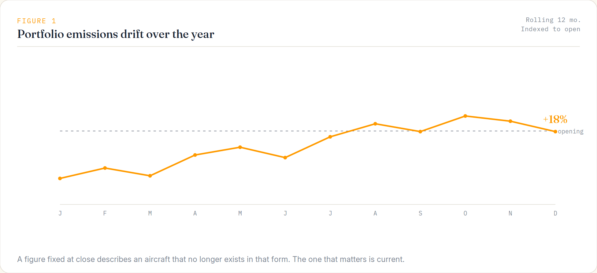
Figure 1: portfolio emissions across a rolling twelve months.
By year end, measured emissions across the book were about 18% off the opening assumption, enough to materially alter reported portfolio and financed-emissions totals and shift regulatory exposure on part of the book.
The share of activity inside EU or UK trading scope had moved with the routes, changing the regulatory cost exposure with no transaction taking place.
Because the figures updated as the fleet flew, those changes became visible as they occurred rather than months later during portfolio review.
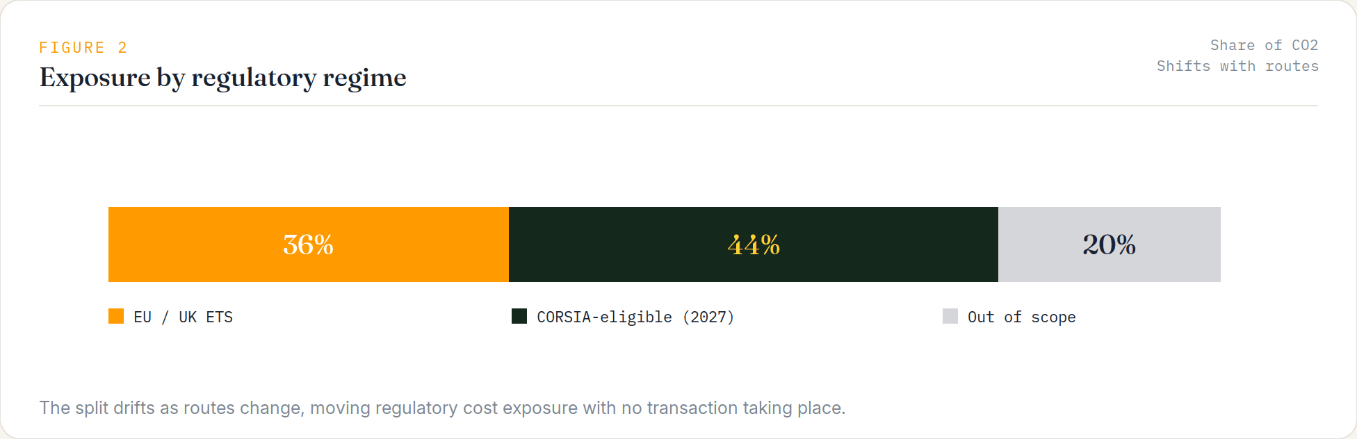
Figure 2: portfolio exposure by regulatory regime, and how the split shifts.
The advantage is not a better emissions formula. It is knowing when the portfolio changes.
The data and methodology
The methodology is public.
Maintaining a live, per-tail feed across a portfolio is the difficult part.
Flight activity comes from ADS-B, updating as each flight completes.
Emissions are calculated using the published EUROCONTROL EMEP/EEA 2023 methodology, with fixed conversions and no smoothing or interpolation applied to measured flights.
Watchlist applies that methodology continuously to the tails you choose to monitor, alerting when activity or exposure changes.
Coverage completeness travels with every figure, so a gap in observation is visible rather than hidden.
What this cannot tell you
Being explicit about the limits is what makes the rest defensible.
It monitors emissions for the tails you select, at flight and route level.
It does not infer ownership of aircraft outside the tails you choose to monitor, and it does not invent data.
Where observation is incomplete, that is shown rather than filled in.
And it is a monitoring input, not a valuation.
Those constraints are what make it usable in a portfolio review.
Exposure monitoring is one application.
The same feed also supports utilisation tracking and route-pattern analysis across the portfolio.
Stop relying on a figure calculated at closing. Monitor the portfolio you hold.